Three Tips for Your Next (Software) Demo
Giulio A. AbboImplementing something is always only half of the work; the rest is, well… showtime! An exciting demo can make the difference between inspiring the world with our creations and not even being noticed. Here are three tips we learned from participating in the Flanders Technology & Innovation festival in Antwerp, in March 2024.
#1: Tailor to the audience
Pulling off a successful demo is not easy, especially when the details of your work matter and the environment is not in your favour. We (the AIRO Social Robotics group!) found ourselves in this very situation at the FTI science fair in Antwerp. Very briefly, the mission was to introduce the public to large language models and social robots, so we displayed two Furhat robots having an enjoyable conversation with each other about a topic chosen by the spectators.
There are thousands of little nerdy things we wanted to tell people: all the small challenges we had to overcome to create the demo, the things we learned, how the technology works, and so on. But knowing that the event targeted curious (not tech-savvy) people and families, we desisted. We also knew that the format was a demo stand, so we would have to fight with other stands for the crowd’s attention. We greatly simplified the setup, down to the bare minimum: two robots, a topic, a conversation created by AI. Simple, easy to explain, and with a nice novelty effect.
#2: Think about the setting
Forgetting this can lead to disastrous consequences. Planning to use a microphone in a noisy environment, relying on a projector or a monitor in daylight, expecting perfect wi-fi coverage. These are all very easy-to-make mistakes if you forget to think about the environment.
In our case, the demo relied heavily on people getting fascinated by the creative ways a large language model can put together a sound debate on a topic of choice. Among the other things, foreseeing a bustling environment, we decided to display the dialogue on a monitor, so people could follow along and enjoy the show.
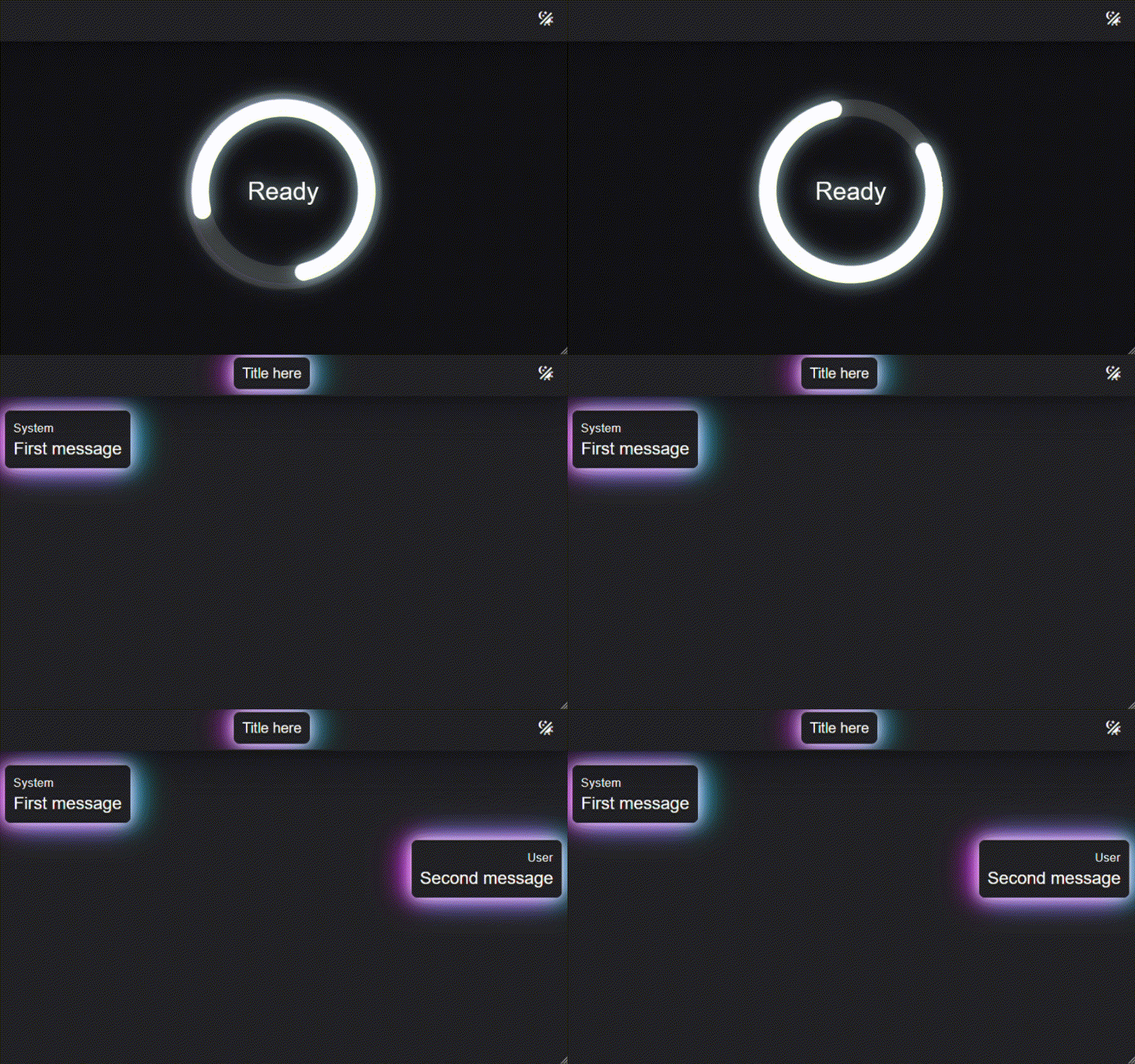
We implemented this interface as an easy-to-use web application, detached from the code running the demo. We are planning to use it again in future demos and it’s available open-source on GitHub! Since we were unsure whether the demo would be displayed on a monitor or projected onto a wall, we tried to make the text as clear as possible and we included both a light and dark theme, for optimal legibility in any light condition; at the same time, we added some futuristic-looking effects to attract people’s attention. Here is how it looks:

#3: Do not forget the brand
Everyone has a brand: the company backing your work, your university, an institution, or even just your name. We shouldn’t be afraid of putting our signature on our work. It can give authority to the demo, and contribute to attracting people’s attention; overall, it helps to tell the background story of your work, and people love stories! We included our university and lab logos in the top left of the interface. While not fundamental for a good demo, this is something that is easy to forget but can add a professional touch to your work.
Bottom line
Setting up a demo for this year’s FTI festival in Antwerp allowed us to reflect on three points:
- Tailor your demo to the audience;
- Think in advance about the setting of your demo;
- Don’t forget your brand.
For our demo, we wrote a simple stand-alone application to display conversation messages, easy to use and eye-catching. You can check it out on GitHub! Hopefully you found these three simple tips helpful. Good luck with your future demos!